The Grove
Typeface Creation
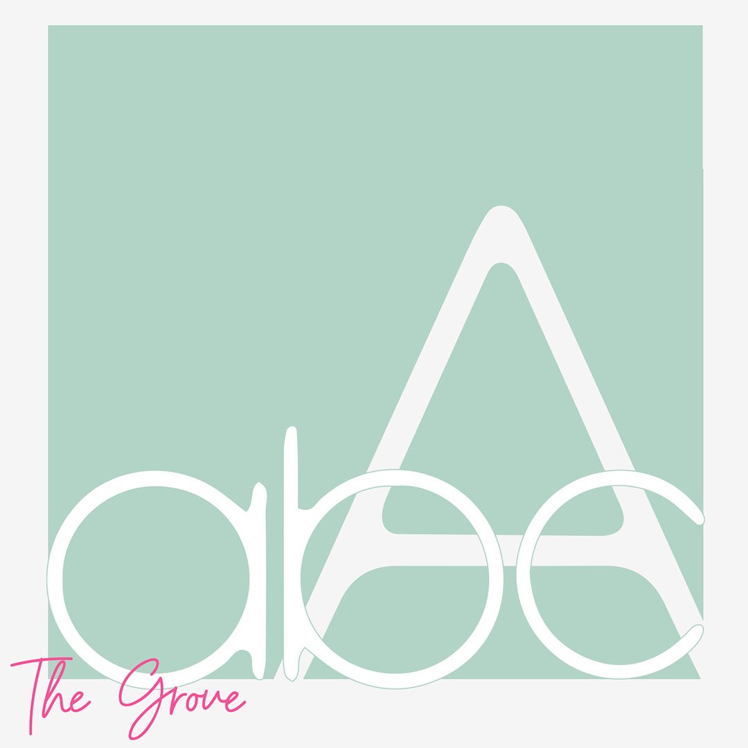
The inspired for the creation of the typeface the grove came from textures and shapes found in nature such as a grove or a forest. I wanted to create a unique typeface that was both organic, yet geometric.
This typeface also features a unique texture, to create a hand-crafted look to each letter. As a result, The Grove is a versatile typeface that could be used for both blocks of text or as a display font for posters, signs and stationary.
The typeface is complete, including upper case lettering, lower case lettering, special characters & numerals.
“Geometric Design”
“Delicately hand drawn, inspired by nature then digitally edited.”
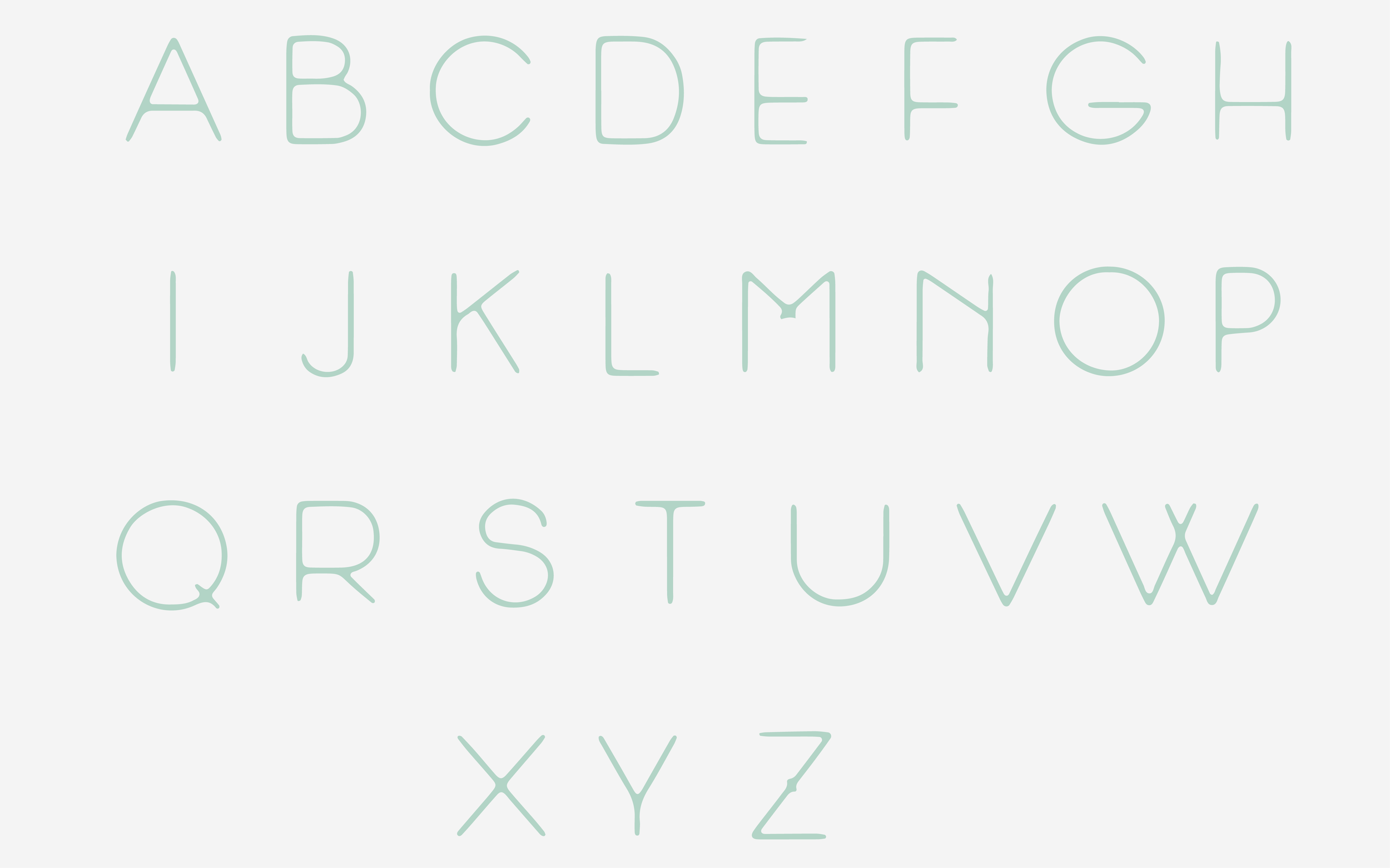
Upper Case
The upper case of the typeface is designed to emulate the canopy of a forest.
Tall, narrow, elegant, individual letters come together forming the canopy.
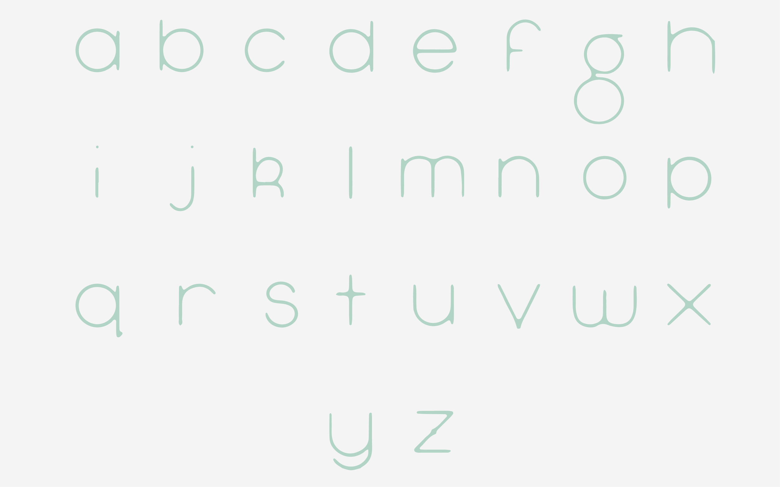
Lower Case
The lower case of the typeface symbolises the shrubbery of the forest floor.
Curved, grounded, soft. Where nature and form intertwines to begin life.
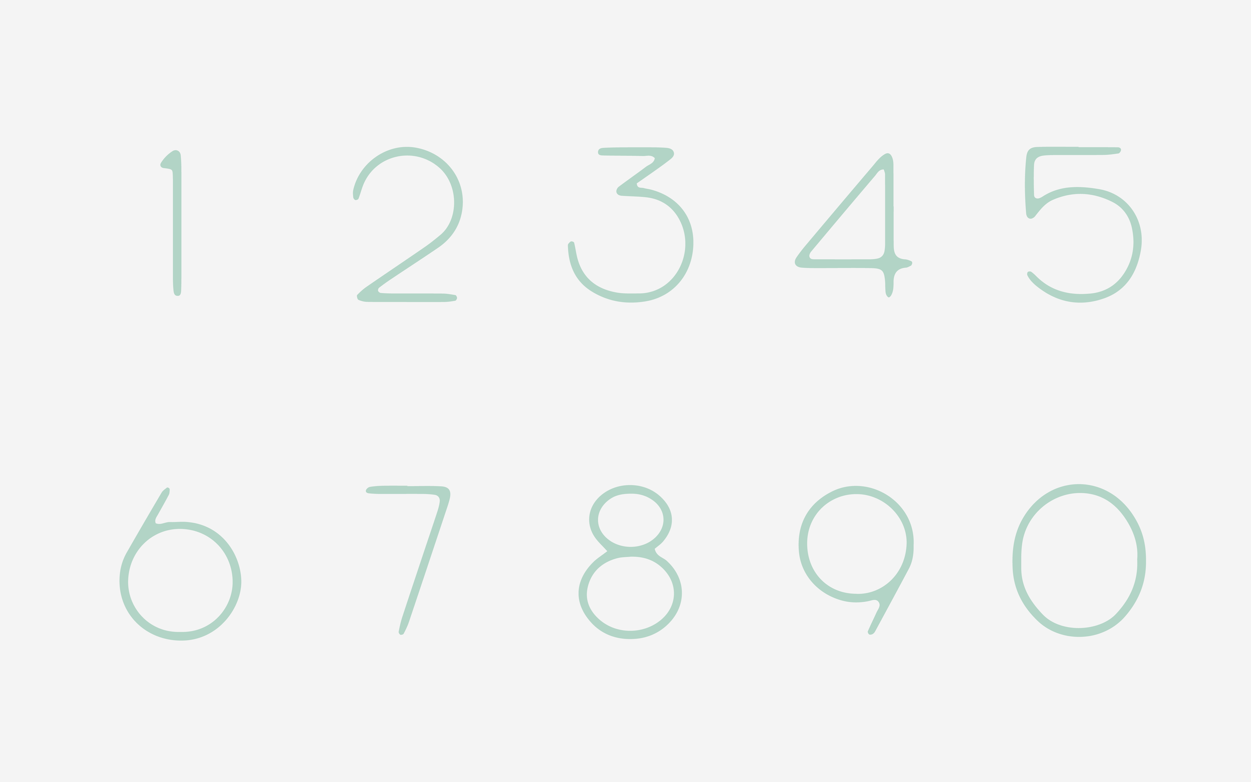
Numerals
The numerals, much like the uppercase, forms part of the ecosystem of the canopy, while pushing into the emergent layer.
Bold, tall, round.
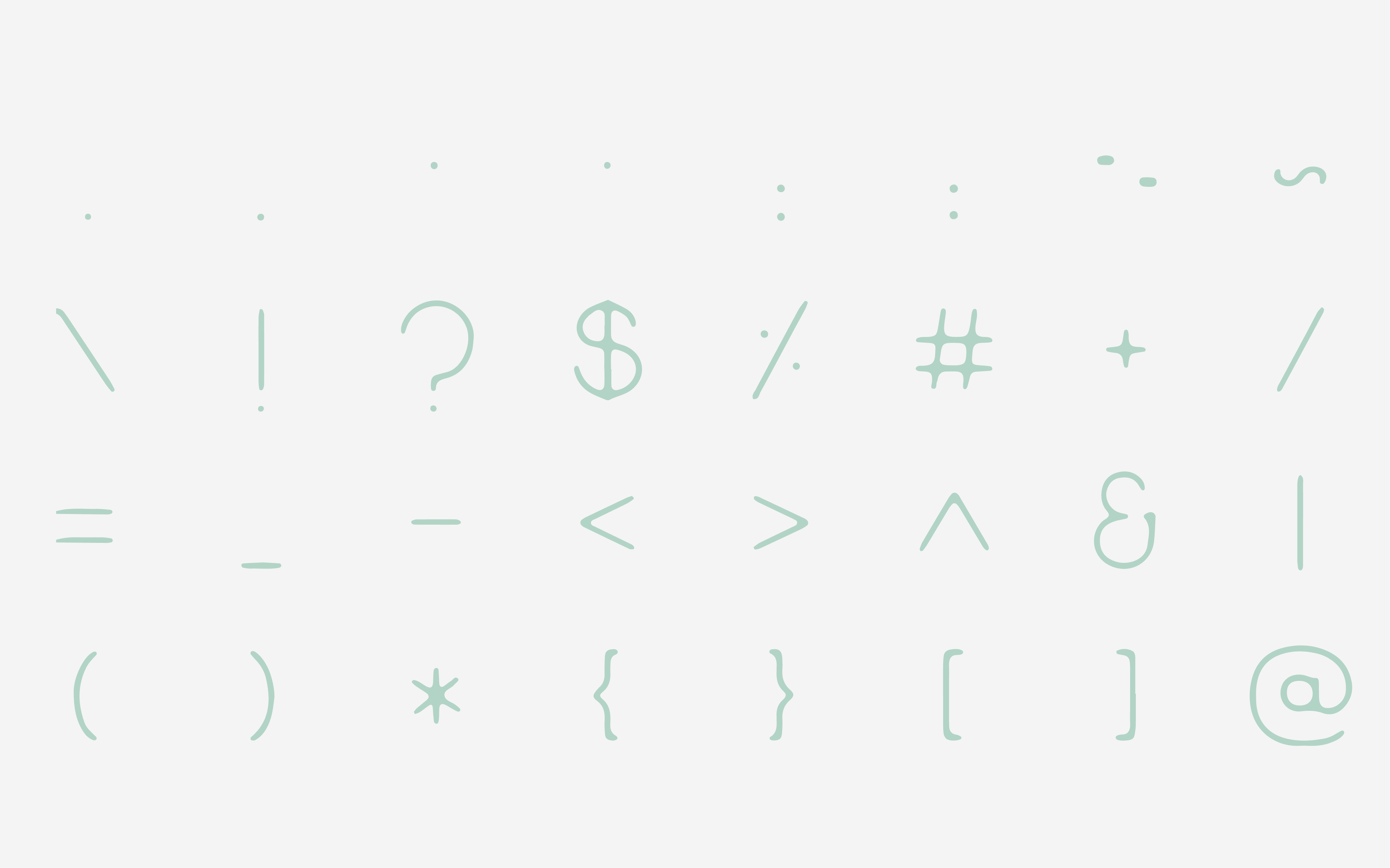
Special Characters
A mix of all the layers of a forest or grove.
The special characters occupy space across the ecosystem of the Grove.
Tall in the canopy, soft and curvy in the shrubs and the forest bed.
“A clean rounded font that emulates the blend of modern life and nature in the form of hand lettering”
